Joy and Company Interior Designs is Based in the Twin Cities of Minneapolis-St. Paul, Minnesota
A qualified interior designer, such as Joy Norenberg, is an expert on the use of color in your home or office to achieve the results you want.
When you open your front door and step inside, what do you see?
Does the space invite you to come in with light, color coordination, and texture?
Every room in your home should invite you to come in and your seating pieces should invite you to sit down.
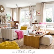
Beautiful Colors Can Bring Life to Your Home and Office
You might want to consider breaking out of the white, off-white, and beige, and let some color in your life and on your walls.
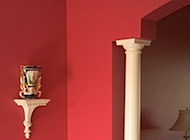
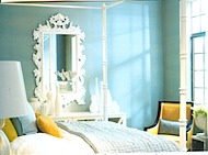
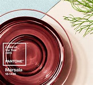
Whites and blues are still very big, and the color of the year is a honey yellow color, and you can also make a big impact with reds and oranges, which are also very popular. But be sure to be true to yourself and the colors that you love!
You need to personally pay attention to how colors make you feel, since color has a huge effect on your mood and energy. But color is also very individual. You may be comfortable with dark colors, while other people may those colors depressing. Colors also affect the nature of human interactions, and when you enter a space you should always take note of the way people interact with one another.
Also take care with the flow of a room and the placement of furniture and other objects. A good flow will create positive energy and also encourage or discourage interactions between people, depending upon the use of the room. Flow is a mixture of organization and design that focuses on removing blockages and allowing easy movement through every area.
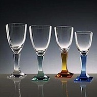
Home decorating color schemes are worked out by means of various color harmonies. The three most used harmonies for decorating with color are monochromatic/dominant, analogous and complementary harmonies.
In a monochromatic or dominant color palette, different tones of the same color are used, as in a room done in beige, tan, and brown. Analogous color scheme is one that uses two or more consecutive colors on the color wheel, such as blue, blue-green, green. Both monochromatic and analogous harmonies may prove lacking in an interesting contrast of color qualities. A complementary color scheme is obtained by combining a color and its complement on the opposite side of the color wheel, as red and green.
It has become popular to have the ceiling - even in period decoration - a paler tint of the wall color rather than white.
The process of decorating with color is part art and part science. With the right use of color you can make your home feel the way you want it to feel.
Choosing Paint Colors
Choosing paint colors or getting ideas for combinations that can potentially look good together with a color wheel can be done by following the proven successful formulas/schemes below. Every single color out there can be found on the color wheel and placed into one of its "categories" (with the exception of white and black - which are technically non-colors, and gray - which is their derivative).
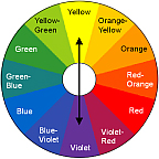
Complementary Color Scheme consists of any 2 colors
lying on the opposite sides of the wheel.
Analogous Color Scheme is created by combining any 3 colors lying next to one another.
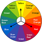
Triad Color Scheme is composed of any 3 colors that are set equal distances apart from one another. Split
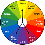
Split Complementary Scheme is defined as a color joined by the colors on each side of its complement.
Double Split Complementary Scheme involves 4 colors, one from each side of 2 complementary colors.